"A clean background is all Google wants."
It makes sense, doesn't it? We've all been trained by years of Myntra, Amazon, and Ajio listings. The general consensus is: 'just make sure the product pops.' For many, 'clean' means a light grey, a subtle texture, or even a soft off-white. It looks professional. It works on other marketplaces, so why wouldn't it work for Google Shopping? It’s a perfectly rational assumption, based on what you see everywhere else online.
Here's the stark reality: Google Shopping isn't 'many marketplaces.' It's Google. And Google has rules. Very specific rules. For your primary product image in the Merchant Center feed, it doesn't just want a 'clean' background; it demands a pure white background. We're talking RGB 255,255,255. No exceptions. No off-white. No light grey. Nothing. Just pure, blinding white behind your product.
I’ve seen brands in Jaipur with impeccably styled kurti sets shot against beautiful, professional light-beige studio backgrounds. Looks great, right? Their entire catalogue got rejected from Google Shopping ads for 'image background violations,' costing them three crucial weeks of setup time right before Diwali. They missed out on an estimated ₹5 lakh in sales because of a background colour that was just a few shades off pure white.
"My existing marketplace photos are Google Shopping-ready."
You've worked hard on those images. They're high-res, beautifully lit, and they've been approved by Myntra, Flipkart, or Amazon India. So, the logical next step is to reuse them for Google Shopping. Why go through the hassle of reshooting or editing when you've already got perfectly good assets? This is where many brands stumble, thinking uniform quality across platforms equals universal compliance. It doesn't.
Google's policy against watermarks, logos, and promotional text on primary images is far more stringent than most Indian marketplaces. That little 'Bestseller' badge you added? The discreet brand logo in the corner? The 'Limited Stock' banner or EMI options you superimposed to drive urgency? All instant red flags for Google. They see it as advertising copy on the product image itself, and that's a strict no-go for the main feed image.
I worked with an apparel brand from Ahmedabad that saw 40% of their new collection’s Google Shopping impressions vanish. They couldn't figure out why their otherwise strong ads weren't showing. Turned out, a graphic designer had added a tiny 'New Arrival' graphic to the top-left of every primary image. Google silently de-prioritised those listings. Removing those graphics immediately brought back their impressions, boosting visibility by over 60% within a week.
Generate your own AI fashion photoshoot with Drapify — 50 free credits, no card required.
"One good product image works for all variants."
We all love efficiency. If you've got a fantastic photo of a basic t-shirt in blue, surely Google's smart enough to understand that it also comes in red, green, and black, right? You just need to list the colours in your product feed, and the system handles the rest. This saves a ton of time and effort, especially when dealing with hundreds of SKUs across multiple colourways and sizes. You'd think, "it's the same design, just a colour swap." But Google doesn't think like that.
Every unique variant, especially colour, needs its own accurately represented primary image. If your product feed describes a 'navy blue kurti,' the image linked must, without question, display that exact navy blue kurti. Not a light blue one, not a graphic with colour swatches, but the actual product in its specific colour. If the image doesn’t match the `color` attribute in your feed, you're asking for trouble: rejections or, worse, low-performing ads because customers are confused or misled.
A client running a menswear D2C brand from Delhi had ads for their 'maroon slim-fit shirt' consistently underperform, generating high clicks but abysmal conversion rates. We dug in. The primary image for that SKU in their Google Merchant Center feed was a dark grey shirt, while maroon was just a listed variant. After updating the image to accurately show the maroon shirt, their conversion rate for that specific product jumped by 2.5X. This is where DrapifyApp can be a game-changer: generating perfectly matched colour variants for your entire collection in minutes, ensuring every SKU has the right visual representation without costly reshoots. It costs around ₹15 per photo, and you can get 4K output.
"Lifestyle images perform best as the primary photo."
It’s a common belief, driven by Instagram and brand websites: show the clothes on models, in real-world scenarios, make it aspirational. You want customers to envision themselves wearing that festive lehenga at a wedding, or that casual shirt at a coffee shop in Bangalore. This approach builds desire and connects with the audience on an emotional level. So, naturally, you'd want to lead with these stunning, contextual shots everywhere, right?
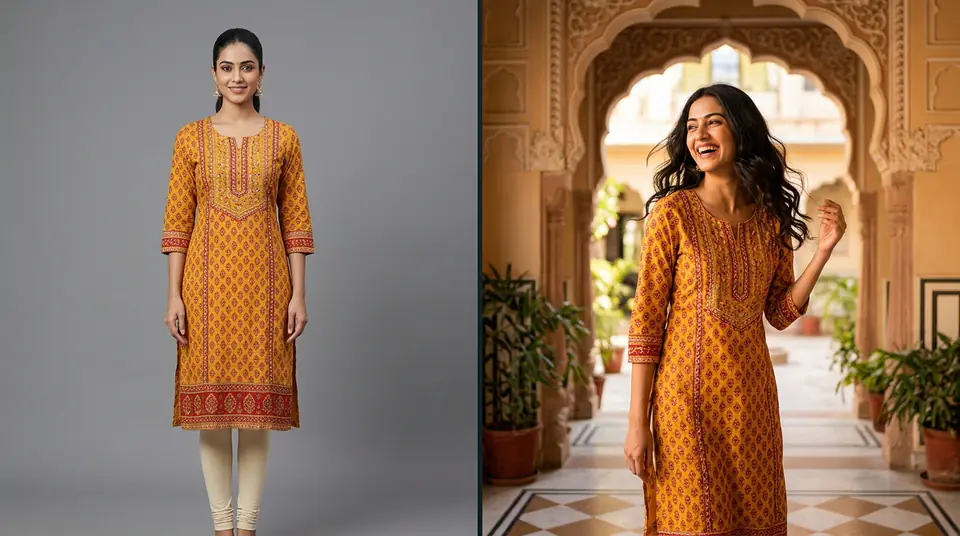
On Google Shopping, that's a costly mistake for your primary image. Google's algorithm prioritises clarity and product focus above all else for the main product photo. It needs to be a clear, unobstructed view of just the product, often on a model or mannequin, but crucially, still against that pure white background. Lifestyle shots have their place, but it's in the `additional_image_link` attribute, and even then, use them judiciously. Your main image is your shop window on Google; it needs to be immediately identifiable.
I ran an A/B test for a client selling ethnic co-ord sets. Their initial Google Shopping primary images were beautiful shots of models in haveli courtyards. We switched the primary image to a clean DrapifyApp-generated photo – product on a consistent model, pure white background, accurate draping. The version with the clean primary image showed a 1.8x higher click-through rate. Customers clicked because they immediately saw the product, not just a vibe. Context sells, yes, but clarity converts first.
"Higher resolution automatically means better performance."
It’s a natural assumption: better quality images lead to better results. A super high-resolution photo with intricate details, crisp lines, and vibrant colours should technically perform better. You invest in a good photographer, maybe even get 8K images, believing that every pixel counts towards a sale. And on some platforms, a certain level of zoomability and detail does matter. But with Google Shopping, 'higher' doesn't always translate directly to 'better' without considering other factors.
While Google does have minimums (250x250 pixels for apparel, recommended 800x800 or larger), simply making an image 'bigger' isn't the whole story. What Google cares more about is the image's aspect ratio and, critically, the stability and directness of the image link. Many brands use image URLs that point to a product page or a CDN that applies redirects. Google's crawlers need a direct link to the image file (ending in .jpg, .png, etc.) without any intermediaries. If your image link isn't rock solid, Google will flag it, regardless of how sharp the image is.
During wedding season, I observed a luxury lehenga brand from Surat consistently getting a 'temporary item disapproval' on about 15% of their feed items. Their images were stunning, 4K resolution, perfectly lit. The issue wasn't the resolution but their e-commerce platform’s CDN; it was occasionally serving redirected image URLs that Google couldn't reliably crawl. We shifted to a direct image hosting solution for their Google Merchant Center feed. Within 48 hours, all disapprovals vanished, and their product visibility shot up for crucial wedding season keywords. It's not just about how good your photo looks; it's about how Google accesses it.